We celebrate the end of the year the only way we know how: through lists, essays, and mixes. Join us as we explore the music and films that helped define the year. More from this series
Lists are like dreams and fingerprints. No two are exactly alike. Print that out in Comic Sans and stick it above your desk.
30
Aphex Twin - Syro
STUDIO: MITDR™
[Warp]
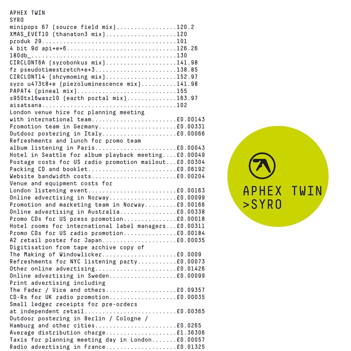
The immaterial transaction of listening and the economic activities of the music industry are explicitly foregrounded in this work of putative non-design. An itemized bill presents the cost of packaging, promoting, and producing Syro, with various acquisitions, meetings, and pursuits valued and accounted for as a fraction of the retail price of a single unit. According to Ian Anderson, director of The Designers Republic, the goal of the Syro art is to pose “questions of the consumer that the content can’t alone.” Richard D. James himself describes the art as “completely culturally deprogrammed… cold microdot vibe, basically.” Syro was also the first ever Aphex release to include a kit list, prompting eager Reddit users to compile this spreadsheet… before it turned out that the kit list was a deliberately incomplete “disinfographic.”
29
Kane West - Western Beats
ARTIST: GUS LOBBAN
[PC Music]

This cover is all about the use of Comic Sans, a thought-provoking anti-design gesture along the same lines as Syro. A report in The New York Times has claimed that readers are less likely to accept as true information presented in Comic Sans compared to information presented in other, more respectable fonts (Georgia, Helvetica). A more robust article in Cognition claimed to provide evidence that uglier fonts such as Comic Sans were harder to read, and that readers experienced faster recollection of information provided in such fonts. If these studies are accurate, the use of Comic Sans on the cover of Western Beats emphasizes the visual pun that links the name of the artist to one of the more acclaimed rap stars of the age, in a letterform that requires deeper cognitive processing to read and is therefore easier to remember.
28
Richard Pinhas & Yoshida Tatsuya - Welcome In The Void
ARTIST: YANN LEGENDRE
[Cuneiform]
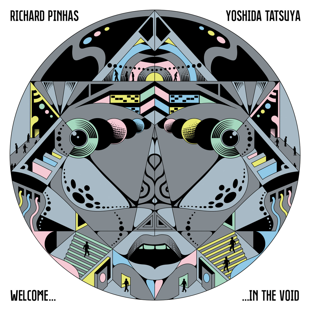
The philosopher/musician Richard Pinhas’s Devolution Trilogy is explicitly devoted to the idea of humankind’s cybernetic degradation. The second part of that trilogy, Welcome In The Void, is a ramble through what Pinhas calls “the nothingness that is now the ‘center’ or the absence-of-center of our societies.” By portraying humanity as a group of tiny, faceless silhouettes, each going about their business within a tastefully-colored maze of tunnels and staircases that, combined, resemble a face, French designer Yann Legendre suggests that the system has a clearer identity than the actors lost within it.
27
Half Japanese - Refreshing
ARTIST: JAD FAIR
[Joyful Noise]

2014 saw the return of brothers Jad and David Fair, better known as post-fi pioneers Half-Japanese, after a 13-year break. To mark the occasion, their label, Joyful Noise, declared that Jad Fair was also their official artist-in-residence for the year. Fair’s signature paper-cuttings are densely-ordered games of symmetry played with scissors, generating bold figures and strange relationships within stark scenes of love, hope, and mystery. Pressed on to dual-color 7-inch, the Refreshing cover art was a typically low-key work of celebratory vigor and contagious small-scale optimism.
26
Arrington de Dionyso & Senyawa - Unheard Indonesia Vol. 5
ARTIST: ARRINGTON DE DIONYSO
[Self-Released]

Arrington de Dionyso’s methodological inspiration springs from the conceptual sweet spot where punk’s DIY morality of the moment overlaps with the quotidian character of Rajasthani folk art. The thinking behind this engagement with the sonic and visual cultures of Indonesia is well-documented in a conversation with Benjamin Pearson published in TMT last year. The artist reveals that his painting and playing are both informed by the same sense of life-consuming intensity in which “producing art is part of the larger cycle of your life.” His distinctive crookedness in either discipline serves as the enchanted signature on a million ecstatic portraits of “the spirits that are inspiring me and setting my brain on fire.”
25
Hieroglyphic Being & The Configurative Or Modular Me Trio - Seer Of Cosmic Visions
ARTIST: KRISS STRESS
[Planet Mu]

Kriss Stress is probably best known as a serial podcaster and archivist of the Chicago Underground Music Scene. The Windy City connection links him to Jamal Moss, the avant Chi-house DJ/producer whose work as Hieroglyphic Being is to Trax as Sun Ra is to Blue Note. Stress has been publishing his own sketch-zines for years, refining a heavily-textured style he calls scrawlcore. The meditative repetition of geometric forms and granular rhythms of detail on the Seer Of Cosmic Visions cover fit perfectly with Moss’s visionary post-industrial percolations.
24
Great Dane - Beta Cat
ARTIST: EMILY BAYER
[Alpha Pup]
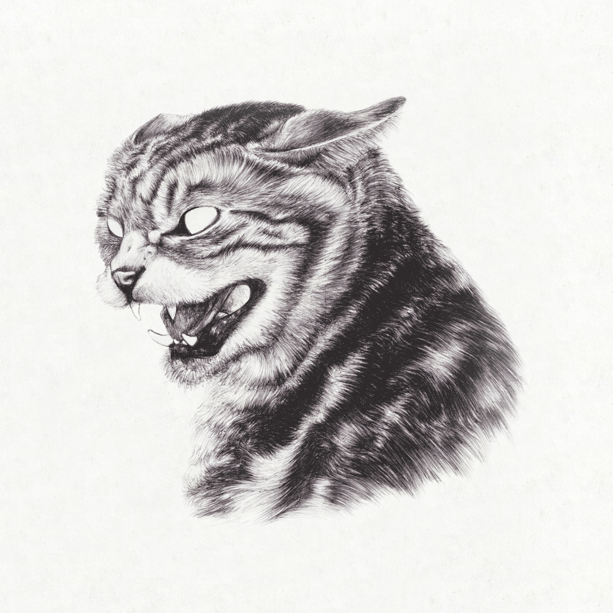
If the internet is a series of tubes and they are full of cats, then the role of album art in the digital age is to be instantly recognizable as a thumbnail in a grid of competing cats. Emily Bayer’s aggressive act of omission tests the durability of the cat as a cipher for the internet’s memetic zeal.
23
Meow The Jewels - Meow The Jewels
ARTIST: JOEL NIXON
[Self-Released]

The release of Run The Jewels 2 offered listeners various special packages at a variety of price points. At the higher end of the scale, $100,000 secured the Fuck Boy Revenge package (“This offer does not include murder”) and $350,000 fetched the Self-Righteousness For Sale package (“Run The Jewels will spend six months pretending to care about whatever you care about. We will travel to no more than three events of your choosing and make eloquent, timely speeches on your behalf”). The middle-tier $40,000 Meow The Jewels package offered to re-record the album “using nothing but cat sounds for music.” One successfully funded Kickstarter project later and Meow The Jewels is real. Joel Nixon’s feline-themed rework of Nick Gazin’s cover art (itself a variation of the original RTJ cover, which made our 2013 list) commemorates one of the unlikeliest episodes in recent hip-hop history.
22
Bloodway - Sunstone Voyager and the Clandestine Horizon
ARTIST: COSTIN CHIOREANU
[I, Voidhanger]
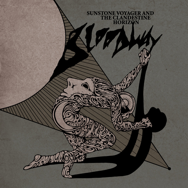
Despite/because of its apparent simplicity, this dramatic composition combines metal art’s characteristically overwrought sense of expression with the full-blooded commitment to symbolism typical of progfusion. All doomy psychedelia wrapped in comic book outlines, the lysergic angst of Costin Chioreanu’s boldly-inked fantasy-rock cartoons brings to mind some of the album art on show within Matthew Ingram’s delightful compendium 100 Lost Rock Albums From The 1970s. The dual sense of stoned sincerity and cynicism-free conviction suggests we are in the presence of a true believer, lighting pictorial candles for a Romantic vision of rock as a seeker’s medium.
21
Todd Terje - It’s Album Time
ARTIST: BENDIK KALTENBORN
[Olsen]

Formal contrasts and eye-catching reflections frame this caricature of the producer as a Cerrone clone. Surrounded by cocktails and palm fronds, chest hair straggling from his unbuttoned V-neck shirt, Todd Terje seems tired and pensive at the piano, weighed down with materialist wisdom. The image of the disco don as a world-weary bon vivant is brought to life with the comic vigor characteristic of Norwegian designer Bendik Kaltenborn’s New Yorker illustrations.
We celebrate the end of the year the only way we know how: through lists, essays, and mixes. Join us as we explore the music and films that helped define the year. More from this series
